
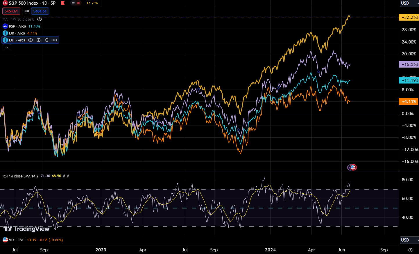
The chart below shows 4 different US indexes, the yellow S&P 500, which represents the large-cap stocks, the purple is IJH or iShares Core S&P Mid-Cap ETF, the cyan RSP or Invesco S&P 500 Equal Weighted ETF, and the orange IJR or iShares Core S&P Small-Cap ETF:
This would allow us to see the performance of the various segments of the US market.
We observe that all 4 were in a tight range, but in recent months, three out of four indexes struggled to go higher. This is similar to other indexes around the world.
Only the S&P 500 was able to power ahead.
The more interesting comparison is the yellow versus the cyan because that measures the cap weighted S&P 500 against the equal weight. The outperformance is likely due to the more heavy focus on Information Technology with the AI theme doing well.
When people say the US is doing better, I am not sure because it would seem most of the large cap, the mid cap and small cap are stalling out.
But in a way, the fundamentals backed it up.
We would often wonder if the market is getting too expensive and the measure of whether value in the market is the price-earnings ratio which is a ratio of taking the price of an index divided by the trailing or forward earnings.
Here is the trailing PE for S&P 500 for the past few months:
May: 27.5 Apr: 26.6 Mar: 27.4 Feb: 26.6 Jan: 25.3 Dec: 24.8
The PE of the S&P 500 definitely expanded, but not so much in the last four months, so why did the price of the S&P 500 run?
I may need to explain the formula


")